Today I set out on my last training run for next weekend’s Brooklyn Half Marathon. Usually I run with Miranda, but since she’s away this weekend I brought The Design Of Everyday Things by Donald A. Norman on audiobook to keep me company. The weather was beautiful, the run was mostly painless, and the audiobook was truly fascinating. Twice during my run I had to stop and record voice memos to myself about ideas the book inspired. This blog post is based on one of those breathless notes.
At a high level, The Design of Everyday Things focuses on how the design of the products we use impacts our lives and how we use them. Taking it one step further, when we have trouble using everyday objects, the author encourages us to blame the designer rather than ourselves. For instance, do you ever recall encountering trouble when turning on the water in a shower? There is no real standard convention for water controls in the shower and many designs are unique. Each time we get into a new shower each of us has to fiddle with the hardware until we achieve the desired result. Which way do the knobs turn? Which side is cold vs. hot? How does one switch from shower to bathtub? How do you adjust the flow of water vs. the temperature?
Norman lays out a construct for guiding designers through solving these kinds of problems. One of the highest-level components of his construct is whether or not the knowledge necessary to use an object is “in the head” or “in the world.” In the case of the shower water problem, the knowledge the user has “in the head” is the fact that you need to manipulate the knobs or hardware in order to get water to come out. This fact is culturally learned and commonly understood. The knowledge that is “in the world” includes the “hot” and “cold” labels on each of the water knobs. Those small labels, combined with the knowledge that we each have in our head, usually allow for us to successfully draw the appropriate volume and temperature water from the bath or shower.
Another construct that Norman lays out is whether the user experience is “broad” or “narrow.” For instance, on the highway, the driver of a car needs a good amount of information in order to know where to exit the highway: which exit is coming up, where that exit goes, how far the exit is away, and what useful utilities (gas, accommodations, etc.) can be accessed through that exit. If provided only once and all at the same time this information would be overwhelming and distracting to drivers. Over the years, a science has been made of delivering the exact information to drivers sequentially as they drive down the road. For example, a common driver’s experience is to first see a “notification” sign one mile away from the exit that an exit is coming up with the exit number and the distance to the exit. Then the driver may see a sign indicating which useful utilities can be accessed via that exit, then they see a larger sign with the exit number, the towns or cities accessed via that exit and its distance away. Then finally, above the ramp, the drivers see just the exit number and towns or cities accessed.
Because of the order and increment of the way the information is delivered to the driver, the experience becomes instantly understandable and easy to digest.
Now to illustrate the power of the principles discussed so far, let’s play a couple games.
The first game we’re going to play is called “Pick15.”
The game is played with two players who alternately choose a single number from one to nine. Each player selects only one number per turn, and once a number has been selected, the other player cannot select the same number. The winner is the first player to pick three numbers that add up to exactly 15.
Take a minute and imagine playing this game in your head. Surely you see that this is an abstract game that is “broad” (requires to you consider lots of information at the same time) and involves storing lots of information “in the head.”
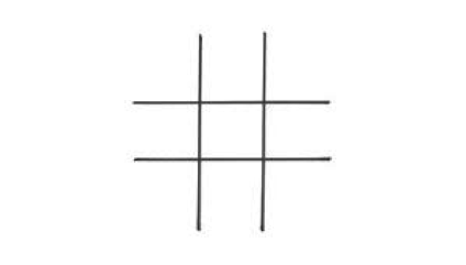
Now, let’s play a different game. This time we’re going to play tic-tac-toe.
On a three by three matrix, two players take turns choosing squares. One player is “X”; the other person is “O.” Once a square is chosen, the player marks the square with their respective mark. The first player to get three squares in a straight line wins.
This is a much simpler game, usually played by children and can successfully be learned by nearly anyone.
Comparing the two games above, you’ll immediately notice that the latter is a much more “narrow” user experience. The information delivered to each player is much more sequential, requiring a relatively simple choice for each turn. Also – the second game requires almost no information to be stored in the head. It’s all right there in front of you.
The user experiences for these two games are very different, which is why you might find it surprising that they’re actually the exact same game.
If you simply write a number in each of the nine cells on a three by three matrix, you can see that the simple game of tic-tac-toe is actually identical to the complicated Pick15 game.

The book, The Design of Everyday Things, is all about product design and users. However the principles here apply even more broadly outside of product design. Whether you’re giving a presentation, making an argument or providing evidence for your opinion, the way in which you present information has a tremendous impact on what your audience will experience.
Making sure that you provide information in a “narrow” scope and making the presentation “in the world” rather than “in the head” can mean the difference between giving a blockbuster presentation and totally losing your audience.
So, next time you give a presentation or design an experience of any sort – stop for a second and ask yourself: “Am I playing Pick15 or tic-tac-toe?”